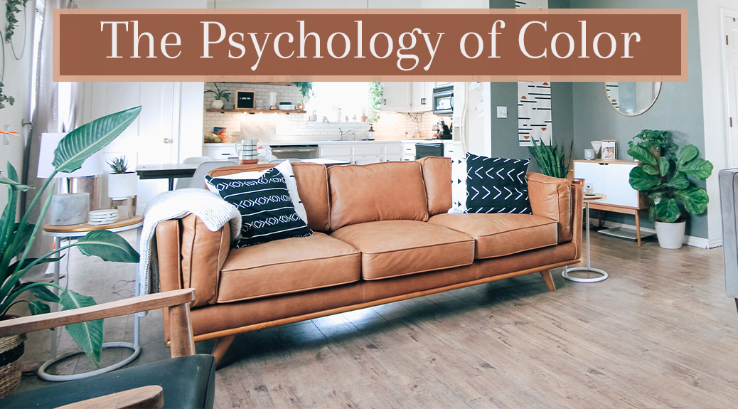
The Psychology of Color
Over 200 years ago in 1810, Johann Wolfgang von Goethe published his book Theory of Colours which suggested different colors can make us feel certain ways. Red can be related to anger or boldness, while green leans towards nature and calm. But is it true? Can colors really make us feel specific emotions? In short, yes. In fact, color psychology is foundational to the “dopamine décor” trend!
The Psychology of Colors
There have been many studies investigating the psychology of color and why different colors give off specific vibes. Evidence suggests colors can influence human behavior and therefore impact everything we do: from what we buy to how we dress, and so on. However, it’s hard to define exactly why colors evoke emotional responses since not everyone experiences them the same way. Factors such as lifestyle, upbringing, and core values have an impact on how we associate colors, and these associations can impact our decision-making.
Colors in Interior Design
This theory is used in many different industries, interior design being one. However, understanding how to use the psychology of color to your advantage can be tricky, especially when you’re not an interior design expert. (That’s what our 100% free Design Studio services are for!) Create the perfect color combination for your interior palette by discovering what each color means!
Yellow
-
Vibes:
- Happiness
- Youthfulness
- Confidence
- Sympathy
-
Color Pairing:
- Green
- Brown
- Blue
- White
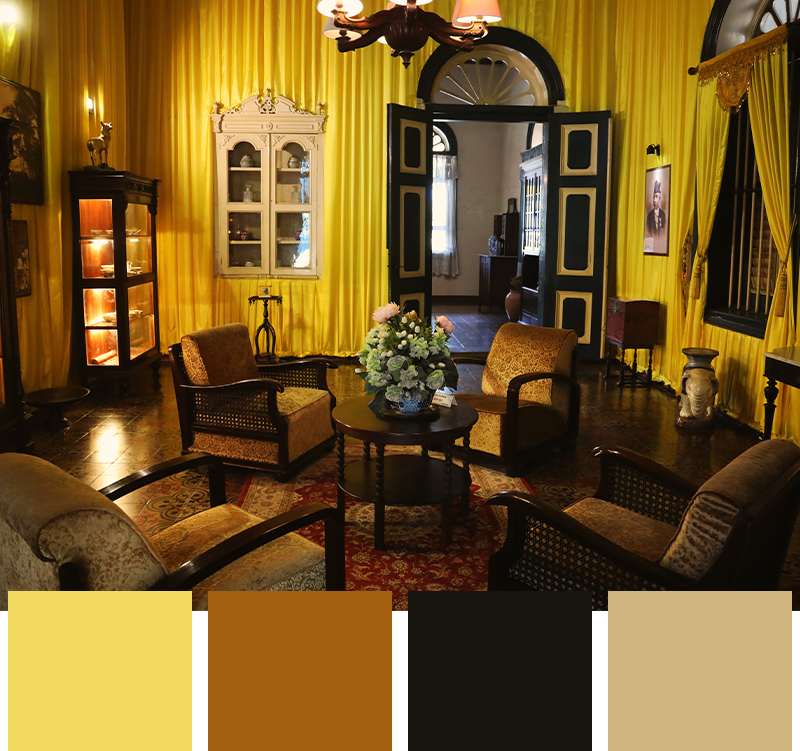
Yellow is commonly associated with sunflowers, smiley faces and maybe even lemonade. When used in interior design, it can promote a happy, cheery, and soothing environment. The color shines, making it an invigorating hue that carries elements of positivity and opportunity. It’s closely linked to spring and summer through flowers and sunshine, and applying it to your color palette is as easy as painted walls, comforters, accessories, or plants. Yellow is a fantastic gender-neutral shade that’s great for a nursery or child’s room and makes a great addition to patio or deck furniture.
Brown
-
Vibes:
- Strength
- Reliability
- Organic
- Warmth
-
Color Pairing:
- White
- Gray
- Yellow
- Red
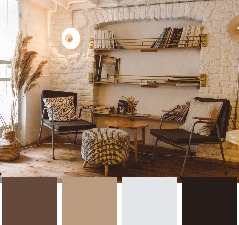
Brown is a neutral color that’s commonly used as a base or building block in interior design palettes. It optimizes the benefit of color combination, meaning it can work entirely on its own or to enhance other colors. This color reminds us of nature, soil, dirt, and trees, which closely relates to stability and growth. It’s a grounding color that soothes our senses and warms up our space. Lighter shades add excellent undertones to other colors, while deeper browns create a solid statement.
Purple
-
Vibes:
- Stability
- Power
- Peace
- Independence
-
Color Pairing:
- Gray
- Pink
- Brown
- White
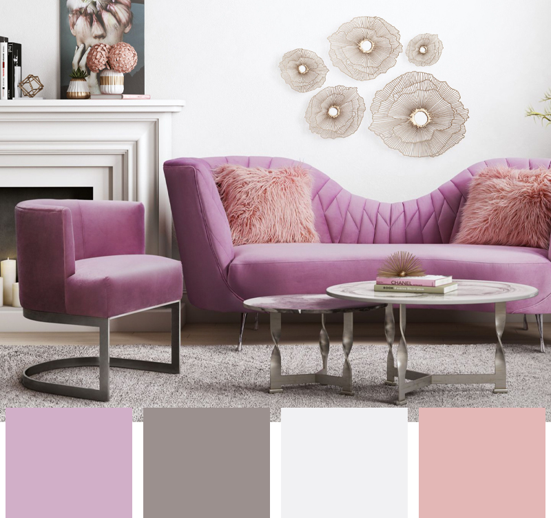
Grounding your space with shades of purple introduces a sense of creativity and independence. This color is often associated with luxury and royalty, and has boldly taken a place in both modern and contemporary design styles. However, having a room full of purple furniture can potentially be overwhelming for guests, even if you love how it feels. Make it your accent or power color, surrounded by gray, white, or light pink for a modern, high-style interior.
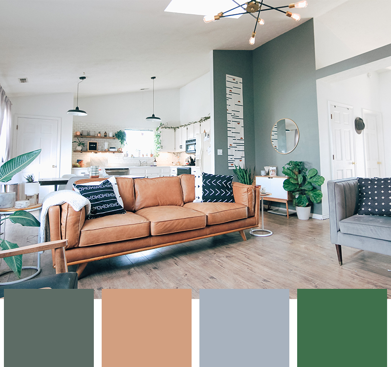
Green
-
Vibes:
- Energy
- Growth
- Ambition
- Envy
-
Color Pairing:
- Brown
- Gray
- White
- Red
Green is frequently associated with the nature and growth, providing a sense of peace and grounding. It’s known to not only be visually appealing but also support well-being. Adding some green to your interior design with décor or live plants can increase optimism, energy, and ambition. There’s a reason why “forest bathing” is so popular in many parts of the world!
Read our Biophilic Design Style blog to learn how you can incorporate greenery elements into your home!
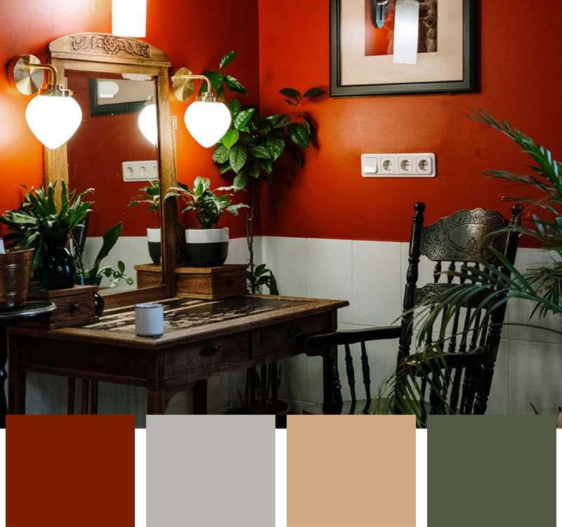
Red
-
Vibes:
- Excitement
- Modern
- Power
- Romantic
-
Color Pairing:
- Purple
- Brown
- Orange
- White
Using red in interior color palettes creates a sense of excitement in your home! Deep reds represent leadership and power and make great bold accent colors for a statement-making, modern interior. Shades like crimson, scarlet, and berry are used in food establishments as evidence suggests it increases heart rate and encourages hunger. Lighter shades of red, like blush, flaunt a sense of romance and playfulness, which pairs nicely with browns, blues, and whites for a more Bohemian look.
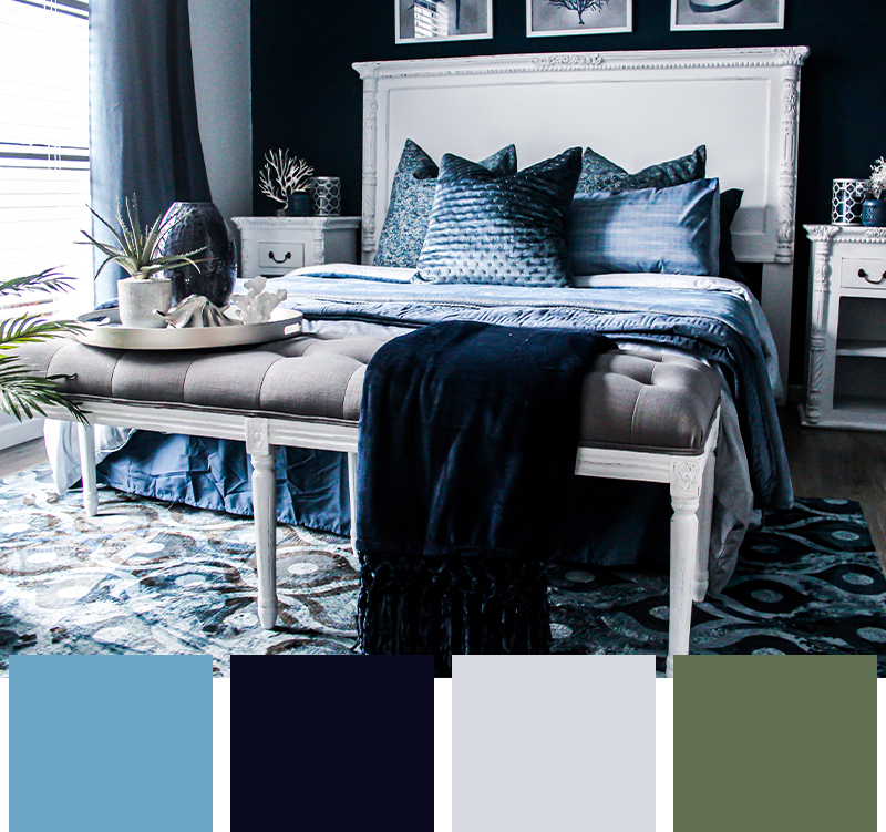
Blue
-
Vibes:
- Tranquility
- Serenity
- Reliability
- Productivity
-
Color Pairing:
- Green
- Orange
- White
- Gold
We naturally link blue to the ocean or the sky which bring with them calming sensations of waves and warm breezes. So, it only makes sense in our brains that we associate blue with tranquility. Using blue in an interior color palette affects our mood positively by promoting serenity. It’s commonly used in bedrooms as it creates a relaxing atmosphere for sleeping.
Tones
Although we connect black, white, and gray with different meanings, they are often all associated with grief, coldness and minimalism. It’s important to find the right color combination for your interior color palette when using monochromatic colors to avoid a cold or sterile atmosphere. Use one of these tones as your base color, then sprinkle in brighter, warmer tones to help liven up your interior. Consider layering in blues, pinks, and brown pieces to enhance a happier and healthy interior.

White
- Clean
- Open

Black
- Sophisticated
- Bold

Gray
- Balanced
- Neutral
Understanding the psychology of color is more than just understanding the emotional response each color invokes. Instead, knowing how to best utilize them in your interior color palette is the real advantage! It is a building block to interior design and a clever way to capture the desired ambiance of a room. Although you can showcase your dominant color through painted walls, it sometimes can be shown with statement furniture and décor. Next time you revamp your home, use the psychology of color to fill your space with positive feelings!
Related Articles

Designer Series: Hal Davis
Designer Series - Hal Davis

Celebrate Yourself this Valentine's Day

.jpg?sw=408&sh=245&sm=cut&q=65 "Incorporating the 2022 Pantone Color of the Year in Your Home")