Incorporating the 2022 Pantone Color of the Year in Your Home

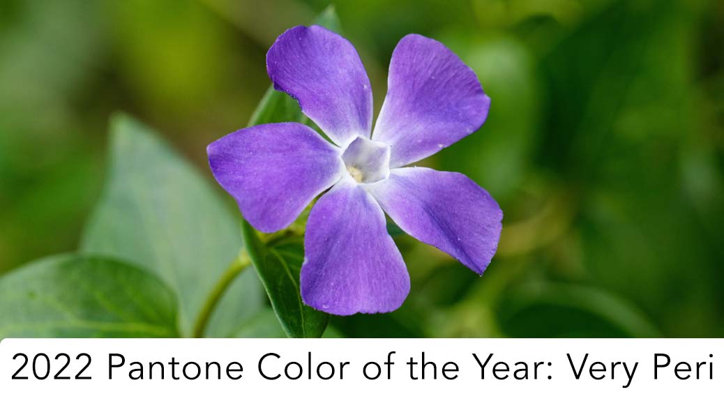
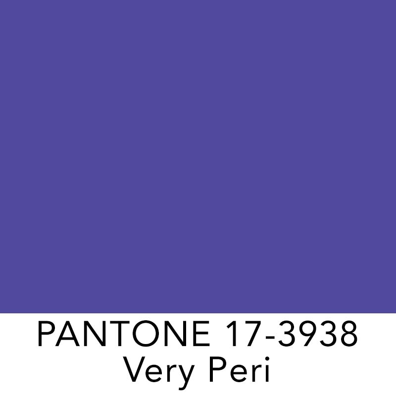
The 2022 Pantone Color of the Year has been revealed, expressing what the year ahead may bring through the power of color and design. This year’s selection is PANTONE 17-3938 Very Peri, a periwinkle blue hue that brings in an infusion of red violet. Confident yet simultaneously carefree, it embraces a joyful and inquisitive attitude that is a symbol for the transition our lives and our world are undergoing.

“As we move into a world of unprecedented change, the selection of PANTONE 17-3938 Very Peri brings a novel perspective and vision of the trusted and beloved blue color family, encompassing the qualities of the blues, yet at the same time with its violet red undertone, PANTONE 17-3938 Very Peri displays a spritely, joyous attitude and dynamic presence that encourages courageous creativity and imaginative expressions.” – Leatrice Eiseman, Executive Director of the Pantone Color Institute
Incorporating Very Peri in Your Home
Color can be used not only to add visual appeal, but also as a method of communication and expressing oneself. With that in mind, incorporating Very Peri in your home showcases your creativity, dynamic personality, positivity, and openness to change and new experiences.
Unlike previous Pantone Colors of the Year, Very Peri is a new color created specifically to express the defining elements of the upcoming year. Because of this, finding furniture and décor that contains this specific hue may be difficult, but similar tones can be used to achieve the same effect.
Very Peri and similar tones will work well as an accent color, giving your interior a pop of color that catches the eye whenever someone walks in. It also works fantastic as a transitional color, blending nicely into your space.
Shop Very Peri and Lookalike Pieces

La-Z-Boy Jasper Navy Rocker Recliner
Amish Outdoors Blue/Black Adirondack Lounge Chair
Related Articles

Designer Series: Hal Davis
Designer Series - Hal Davis

Celebrate Yourself this Valentine's Day


.jpg?sw=408&sh=245&sm=cut&q=65)